

THE BOTTOM LINE
Tops are one of the most daunting challenges a stock market analyst has to diagnose, as gossamer like euphoria tends to dissipate slowly making the “straw which will break the camel’s back” extremely difficult to identify in advance. There has been growing evidence for weeks now that the latest leg up in the great bull market was showing some signs of fatigue, but not universally as some areas of the market have continued to grade out as being in strong rallies, while others not so much. For example, the McClellan oscillator has been below its zero line and turning lower, but certain segmented versions of it show some sectors in strong uptrends by contrast.
The stock market now appears to be beginning some price weakness with perhaps the potential of the September to October eleven percent correction, or if the theory of declines proportionate to extremes of valuation and bullish sentiment existing at the beginning of the decline, then perhaps the possibility of something larger may exist. In any case the risks implied by a number of historic extremes has led me to investigate finding a liquid ETF to diversify client risks, which has the potential to grow, even if the market becomes highly volatile, and/or enters another bear market, which is not currently implied by favorable measures of supply and demand according to the well-respected Lowry Research.
Our research to address these conflicting implications has concluded for the most part, and we will be beginning to slowly build a new core holding in a unique ETF product as opportunities arrive to make purchases, when the price comes under pressure. This ETF product has the potential to universally participate in what appears to be two emerging disruptive trends. If these trends do continue to materialize, then global societies will change radically at an accelerating rate of change powered in the most part by the attitudes of a new generation of young adults, which readily accept change as progress. More on our strategy later, as we begin to accumulate our new core holding ETF position.
Investors should expect a volatile stock market as the calendar begins to turn toward the looming days of spring.
Expect Volatility
The last several of these weekly market updates have been observing that while no direct correlation has been proven between overvaluation and stock market tops, when valuations become so rich as to touch historic extremes the market tends to struggle, and then often adjust the price back to in line with more historic average ranges. The same concept has been pointed out to investors regarding extremes in sentiment, in the current case extreme bullish sentiment.
The theory of contrary investing holds that when investors are extremely bullish the price may be vulnerable to a correction, because there are too few investors left to buy in order to continue the rally uninterrupted. And, on the contrary, no pun intended, when investors in the aggregate become extremely bearish there are too few sellers left to push the price lower. These two complimentary notions, plus negative divergences in a number of strategic and tactical supply and demand indicators, appear to have begun to manifest their implied powers these past few days, as the stock market as measured by the Dow and S&P-500 closed on Friday below where it began the year.
TATY — A REPRESENTATIVE OF A FAMILY OF STRATEGIC SUPPLY AND DEMAND INDICATORS

TATY is shown above in Snapshot-391 in yellow with the S&P-500 overlaid in red and blue candle chart weekly format.
TATY finished the week at a weak 109 after flashing a Big Chill warning previously by descending into the caution zone surrounding the 115-125 level, and then stalling out after only briefly touching into the red zone surrounding the 140-144 level in November. Big Chill warnings have a consistent history of foreshadowing market weakness, significant tops, and rebound tops in bear markets. The current weakness in the price is the most in the last three months dating to the September-October eleven percent correction. So the key question at the moment is whether this price decline is just beginning, or is it just a fleeting dip before another attempt to assault new all-time highs, as the stock market anticipates liquidity for as far as the eye can see compliments of the Fed.
The TATY chart also displays a premium/discount to value indicator in the lower panel, which is assaulting the minus eight level denoted by the horizontal red line. The history of this premium/discount indicator is such that until the indicator bottoms in negative territory, and then rallies back to the green line denoting the minus three level a bottom has yet to be reached. The premium/discount indicator has a long history of bottoming out before the price, and then rallying ahead of the price first taking out the minus three (green line) level, and then the zero line. And, once above the zero line the newly minted rally tends to be recognized by investors, which causes the price to begin to accelerate higher, as buyers swoop in to purchase perceived bargains.
The odds were good that the recent extremes in valuation, bullish sentiment, and a host of indicator negative divergences would trigger some price weakness, and now it has. In like manner, a positive divergence forming in the TATY, premium/discount, and other supply and demand indicators, will likely lead to the next phase of rally. For now all we can say is the BIG Chill warning has done its job of foreshadowing some price weakness, which may have further to go before demand is reinvigorated.
SAMMY — A REPRESENTATIVE OF A FAMILY OF TACTICAL SUPPLY AND DEMAND INDICATORS

SAMMY is shown above in yellow bordered in blue with the S&P-500 overlaid in red and blue candle chart format in weekly format in Screenshot-199, and in daily format in Screenshot-200 below.
Screenshot-199 still shows the negative divergence, which developed prior to the February top, and subsequent record setting plunge. This negative divergence is shown as a dashed down sloping magenta line. The down sloping orange line shows an even larger negative divergence in place for weeks, as the price marched ever higher. And, the end portion of the orange line shows how the recent price highs occurred without any confirmation by the SAMMY indicator, although SAMMY did manage to rally weakly above resistance shown on the chart as a horizontal magenta line. This implied the price was being driven to new all-time highs by lesser strength in the supply and demand balance than at the February high.

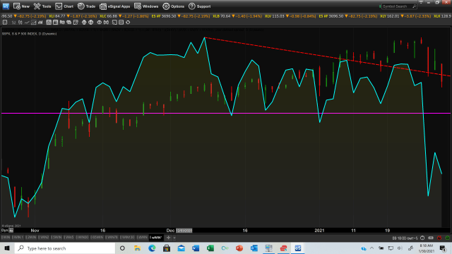
Screenshot-200 shows SAMMY in daily format in light yellow bordered in blue with the negative divergence shown as a down sloping dashed red line,. The negative divergence has now yielded to enough price weakness to cause SAMMY to descend back below the horizontal magenta resistance line. So what is one to make of this, and what are the implications for how investors should posture their portfolios? That brings us to Screenshot 202 (just above), which is the S&P-500 in red and blue candle chart format, which shows a lower support line in orange from the March 23 low through Friday’s close. The price has declined to marginally above this support. The turquoise upper line represents resistance to the recent rallies, so for the time being the price has been oscillating between these two support and resistance boundaries.
Overvaluation, extreme bullish sentiment, and a host of negative divergences prior to the current price weakness imply an assault on the lower orange line support is more likely than another rally to new all-time highs, in the absence of evidence of sufficiently reinvigorated demand. The premium/discount indicator has not bottomed, so the implication is the price is likely to continue to probe the up sloping orange line representing support. A breach of this support would imply the possibility of the price accelerating lower, and if support is tested but holds, then the odds would turn in favor of another attempt to assault new all-time highs. This option would imply a rally potentially back toward the up sloping turquoise resistance line. This would be consistent with a slow degradation topping situation. Tops take time, so this outcome remains a viable one. The good news is that resolution of the two potentials is closer than it appeared just a few days ago.
One last comment before we move on to the bottom line. I have recently read a theory that put forward the notion that historic extremes in overvaluation, and bullish sentiment, potentially imply a correction in the offing proportionate with the extremes reached prior to the correction. I’ve never seen anything in print supporting this notion, and the author did not reference his source. Given that the September 3rd 1929 Dow top preceding an almost 90 percent wipe out down to the July 8, 1932 bottom was preceded by a price to earnings ratio, which could be considered cheap relative to the market’s current 2021 P/E ratio, then the implications are quite serious, if the great bull run is approaching expiration. If any of you receiving this update, which includes investors on nearly every continent except the Artic and Antarctic, have any additional research regarding this theory, then I would appreciate you sharing your thoughts with me.